The year recap feature is coming to the Apple Health Parser, providing insight into your health data over the time span of a year
Preface
In early July 2024, I released the first version of the Apple Health Parser Python package via PyPI. The following year, in late July 2025, I added sleep analysis capabilities to the package, which I detailed in a blog post. Now, I'm excited to announce the latest feature: a year recap of your health data. This new functionality allows users to gain insights into their health trends over the span of a year.
Motivation
Over the years, I've noticed that a few platforms started providing a yearly summary of the usage of said platform. For example, notable music streaming services have already been doing that for a little while (e.g. Apple Music, Spotify). Gaming platforms also started doing that a few years ago (e.g. Nintendo). And this trend is not exclusive to pure consumer services, instead it seems to be spilling over in other types of digital platforms (e.g. LinkedIn, Reddit).
Last month I was poring over possible improvements or features that the Apple Health Parser could benefit from. And the first thing that came to mind was that the package didn't come with a convenient way to generate an annual summary of the most relevant health metrics - similar to what you see in the services I mentioned above. So I decided to build that feature myself, and in this blog post, I’ll walk through the thought process and bits of the implementation here and there.
Implementing the Year Recap feature
I decided to implement the year recap feature as a standalone script within the package. This way, it can be easily run from the command line and doesn't require any additional setup or configuration. The script takes in the Apple Health data, processes it, and generates a PDF report summarising the most relevant health metrics for the specified year. I'll go over the design and implementation of this feature in the following sections on a high level. If you're curious about the details, feel free to check the repository.
Design
For projects that require more thought and clarification from the start, I’ve come to develop a habit of writing down how I envision them first. This is no different for this new feature. The premise is simple: generate a summary of the most relevant health metrics for a given year. At first I thought of an interactive format (e.g. HTML), but I later reconsidered and opted for a simple and intuitive PDF report. This would be arguably straightforward to implement, with a more rigid structure to adhere to.

Apple Health Parser - Year Recap design.
The layout itself is as simple as can be: a title, a subtitle (the specified year), and one section per health metric with plots and descriptive text to go with it. Initially I thought of adding tables but soon realised they would "crowd" the space too much. And anyway, how does the saying go again?
A picture is worth a thousand words.
Instead, I'll focus on including clear and informative plots in the report. The plots themselves will apply an operation (e.g. mean, sum) to all the records per week. This keeps the plots simple and easy to understand, while still providing a good overview of the trends in the data. The descriptive text will be generated using templates defined in a YAML file, which I will get to in the next section.
Implementation
I wanted this new feature to be simple and intuitive for the end user, so a script that can easily be run from the command line seemed like the most suitable approach. On a high-level, the script follows this flow:
- Parse the Apple Health data
- Postprocess the data for each given health metric
- Generate the plots
- Generate the report sections
- Output the report (in PDF format)
I'll skip the part of the code that parses the data since that has already been addressed in an earlier post.
Postprocessing the data for each metric
Next, to postprocess the data for each metric, we need to define said metrics. This is done similarly to how the Apple Health Parser already handles flags metadata - using a YAML file. As an example, for the HKQuantityTypeIdentifierActiveEnergyBurned flag, we have the following entry in the YAML file:
HKQuantityTypeIdentifierActiveEnergyBurned:
  axis_label: Active Energy Burned (kcal)
  color: "#ff7043"
  description: Sum of active energy burned per week (...)
  flag: HKQuantityTypeIdentifierActiveEnergyBurned
  marker_color: "#ffa726"
  name: Active Energy Burned
  operation: "sum"
  plot_type: "bar"
  summary_template: Over the period, you burned a total of (...)
Essentially, we have top-level keys referring to a health metric which hold key-value pairs, one for each metadata field. I decided to go with dataclasses to hold this metadata. They are straightforward, readable, and have useful methods built-in. Note that I decorated the MetricsDefinition dataclass below with the @dataclass(frozen=True) decorator. This makes the dataclass an immutable object where attributes cannot be modified after initialisation.
@dataclass(frozen=True)
class MetricDefinition:
    axis_label: str
    color: str
    description: str
    flag: str
    marker_color: str
    name: str
    operation: Operations
    plot_type: PlotType
    summary_template: str
    unit: str
You can see that some of these fields are directly used for the plots (e.g. axis_label, color), while others are used for the descriptive text (e.g. description, summary_template). The operation field is used to specify the operation that will be applied to the records of the given metric when generating the plots. This is defined as an Enum in the code in apple_health_parser/config/definitions.py.
class Operations(StrEnum):
    COUNT = "count"
    MAX = "max"
    MEAN = "mean"
    MEDIAN = "median"
    MIN = "min"
    SUM = "sum"
To read from the YAML file we need to use two modules: importlib and yaml. We then create METRIC_DEFINITIONS by iterating over each entry in the YAML file and creating a MetricDefinition object for said entry.
metrics_file = (
    resources.files("apple_health_parser.scripts.recap.metrics") / "metrics.yaml"
)
metrics_content = yaml.safe_load(metrics_file.read_text())
METRIC_DEFINITIONS: dict[str, MetricDefinition] = {
    flag: MetricDefinition(**metadata) for flag, metadata in metrics_content.items()
}
What this is doing is just loading the YAML file, parsing its content, and creating a dictionary where the keys are the metric flags and the values are MetricDefinition objects containing the metadata for each metric. This allows us to easily access the metadata for any given metric when generating the plots and descriptive text for the report. For example, if we want to access the metadata for the HKQuantityTypeIdentifierActiveEnergyBurned metric, we can do it like this:
flag = "HKQuantityTypeIdentifierActiveEnergyBurned"
metric = METRIC_DEFINITIONS[flag]
print(metric.name)  # Output: Active Energy Burned
print(metric.unit)  # Output: kcal
I'll skip the nitty-gritty of the implementation, but the general idea is that we iterate over each metric defined in the YAML file, do some data manipulation to get the data in the right format for plotting, and then we apply the specified operation to the records of that metric.
Generating the plots
The plots themselves still rely on plotly, as is the case for the rest of the package. But since these are customised to show data agglomerated per week, I had to implement some custom logic to get the data in the right format for plotting. This involved grouping the records by week and applying the specified operation to each group. For example, if we want to generate a plot for the HKQuantityTypeIdentifierActiveEnergyBurned metric, we would first group the records by week and then apply the sum operation to get the total active energy burned per week. And depending on the specified plot_type in the YAML file, we would generate either a bar plot or a line plot.
Bar plot
A bar plot is a good way to visualise data that has been agglomerated per week. When dealing with summed data over a period of time, I instinctively think of bar plots as they provide a clear visual representation of the total values for each time period. In this case, a bar plot would effectively show the total active energy burned per week, making it easy to see how active you were per week throughout the year.

Example of a bar plot showing the total active energy burned per week.
For bar plots, there is a special case that I had much fun implementing - the HKQuantityTypeIdentifierTimeInDaylight metric. This metric represents the amount of time spent in daylight.
# Time in daylight gets a special color mapping based on the value
if flag == "HKQuantityTypeIdentifierTimeInDaylight":
    bar_kwargs["marker"] = dict(
        color=df_merged["value"],
        colorscale=[[0, "#1a237e"], [1, "#ffd700"]],
    )
The outcome is a bar plot where the color of each bar is determined by the value of the metric for that week. In this case, the color scale ranges from a dark blue (representing lower values) to a bright gold (representing higher values). It's just a fun way to see it since we naturally see yellow as the colour of daylight. So the more time you spend in daylight, the more yellow your bar will be!

Example of a bar plot showing the total time in daylight per week, with a custom colour mapping based on the value.
Line plot
A line plot, on the other hand, is (in my opinion) more suitable for visualising trends over time. When dealing with averaged data over a period of time, a line plot can effectively show how the average values change from week to week. For example, if we want to visualise the average resting heart rate per week, a line plot would allow us to easily see any trends or patterns in the data, such as whether our resting heart rate tends to be higher or lower during certain weeks of the year. And perhaps it could lead us to some insights about how our lifestyle or habits affect, in this case, our resting heart rate.

Example of a line plot showing the average resting heart rate per week.
Box plot
Beyond bar and line plots, I also included a box plot. Box plots are particularly useful for visualising the distribution of data, especially when you want to understand the variability and identify any potential outliers. For this, I decided to go with daily instead of weekly agglomerated data, as the distribution of daily values can provide more insights into the variability of the data. It offers more granularity and allows us to see how the values fluctuate on a daily basis.

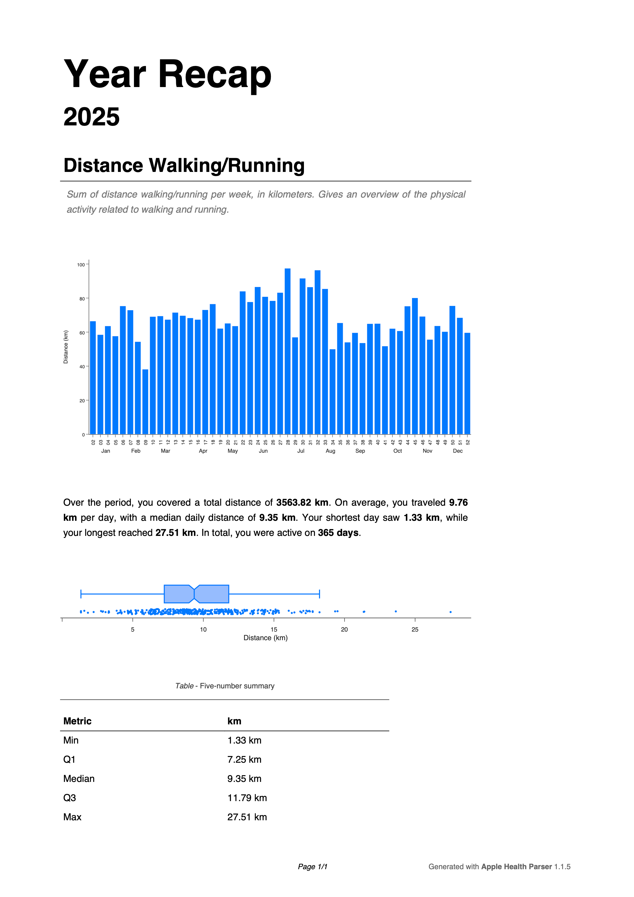
Example of a box plot showing the distance walked/runned per day.
Generating the report sections
To generate the pdf, I decided to make use of the fdpf2 package. This part of the code is pretty self-explanatory, as it just involves creating a PDF document, adding the title and subtitle, and then iterating over each metric to add the corresponding section to the report.
for page, (flag, section_data) in enumerate(pdf_section_data.items()):
    metric_metadata = METRIC_DEFINITIONS[flag]

    year, image_data, box_image_data, stats_text, quantiles = (
        section_data.year,
        section_data.image_data,
        section_data.box_image_data,
        section_data.stats_text,
        section_data.quantiles,
    )
Generate the report
Finally, once all the parts of the report have been generated, we can output the PDF file. The report should be automatically opened once the script finishes regardless of the operating system.
Example of the generated report for 2025.
Outro
Ideally, I'd like to make this report more customisable in the future, allowing users to choose which metrics they want to include in the report. Requests and issue reports are always welcome on the GitHub repository. As docs for the year recap feature, you can find them here.